Elise False Lashes (affordable AND good!)

Posted by Lipglossiping On April - 2 - 2011

I was born with feet for hands.  Not literally you understand, I mean I don’t actually have toes for fingers… but dexterity wise?  May as well have.

Because of this, I don’t wear false lashes very often but I’m always left wanting to buy some whenever I visit my local CCO.  There’s this SA in there who’s simply stunning (total girl crush) and she always wears perfect false lashes, full and flirty with no hint of Katie Price… they darken her lashline and open her eyes.

Anyway, after my last CCO jaunt, I came home and got straight on the net to satisfy my urge for lashes that I’ll probably never wear out of the house and I came across these:
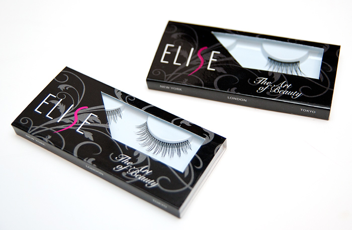
I favour flirty, natural-looking lashes over the thicker types which I really struggle with and these looked perfect!  I bought two pairs from eBay and they cost around £2.50/£3.00 each once shipping had been added.  Bargain!

Have some piccies…
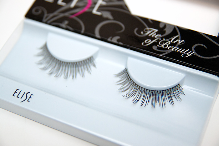
The boxes aren’t numbered which is a bit of a silly oversight, so I had to do some detective work.  These are #461 – they’re very curly and the band is super-fine and flexible.  The lashes feel soft… really nice for a natural look.  The band is quite long though, I had to cut about 4 knots in to achieve the right length for my lashline.
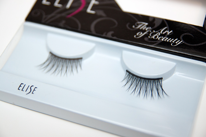
These are demi (half) lashes, #079 – the band is thicker and slightly stiffer but softens up well with a bit of manipulation.  I’m in total love with these because they really extend my eye outwards and give an almost cat-eye effect…. slinky!  I’m buying a couple more pairs of these this weekend to make sure I have some for wedding season!

Because they’re only half length, I also find them easier to apply… less band, less chance of sticking them to my eyebrow right?!
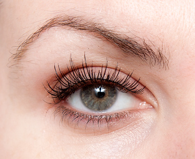
Excuse the messy brows, I’ve nearly managed to grow them out (whoop!) – I’m booking myself in for a mahoosive threading session next week.

Anyway, back to the lashes, these are the 1st pair (#461), you can see that the curl is strong and the lashes, fine and a touch feathery.

All in all, I’m really pleased with my bargain discoveries from Elise!  You should note that they don’t come with any glue and unlike simillarly-priced Red Cherry lashes, aren’t human hair.

What are some of your favourite false lashes and how often do you wear them?


A layout update, please read…

Posted by Lipglossiping On April - 2 - 2011

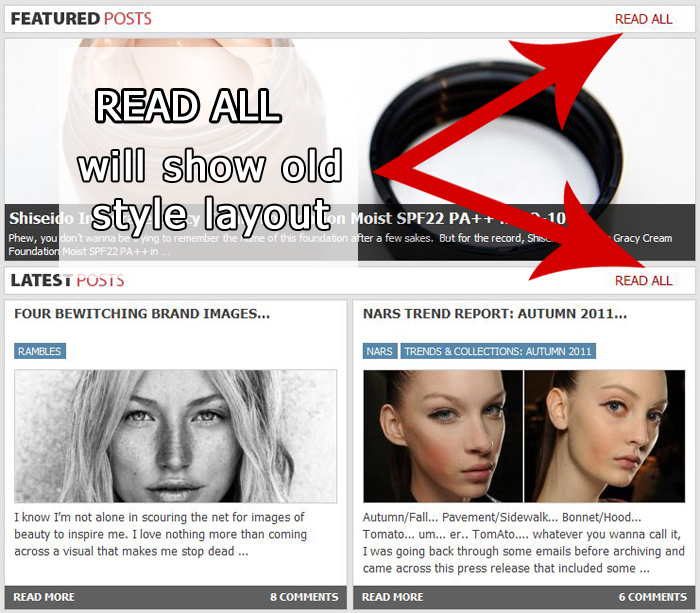
~ If you click READ ALL (next to LATEST POSTS) you will be directed to a second ‘home page’ which will display all posts in the old-style scrolling layout.  You can update your bookmarks and access this page by default if you prefer.  Alternatively, you can subscribe to Lipglossiping.com through a reader or by email and view the site as RSS formats it.

Please note: “Featured Posts – READ ALL” displays only the ‘featured’ posts in the old-skool layout.

~ We have tweaked the colours and the labels (most obviously from red to blue) which will hopefully inject some of the previous site’s colour scheme into the template and increase familiarity.

I hope these changes are considered an improvement.

Four bewitching brand images…

Posted by Lipglossiping On April - 1 - 2011

I know I’m not alone in scouring the net for images of beauty to inspire me.

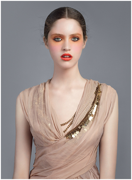
I love nothing more than coming across a visual that makes me stop dead in my tracks and just… absorb.  A recent one that spoke to my makeup-loving heart was one of Givenchy‘s Spring campaign images.

The eyes, the lips… the pink, the orange… even the wispy hair… just perfect!

Another of my favourites and instantly recognisable.  Sonya Kukainis embodies the natural, polished beauty that BECCA Cosmetics sums up for me.

My personal favourite from the Illamasqua campaigns (and there are a lot of beautiful images to choose from!) is this one from the most recent Spring/Summer Toxic Nature collection.  It’s frivolous, powerful and total eye-candy in one crazy package.

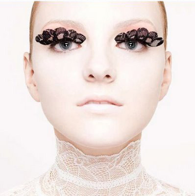
And finally, a classic from 2008 and Shu Uemura‘s Tokyo Lash Bar… I remember being quite awestruck at practically all the lash images released around that time from the brand.  Amazing!

Do you have some favourites?  Would any of the above make your list?

NARS Trend Report: Autumn 2011…

Posted by Lipglossiping On April - 1 - 2011

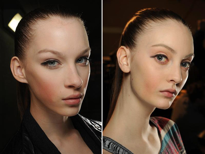
Autumn/Fall… Pavement/Sidewalk… Bonnet/Hood… Tomato… um… er.. TomAto…. whatever you wanna call it, I was going back through some emails before archiving and came across this press release that included some images from the Marc Jacobs Fall 2011 Runway Show.

It looks like Autumn might be all about the blush.  Yes, that’s me you can hear me fist-pumping and whooping from thousands of miles away…

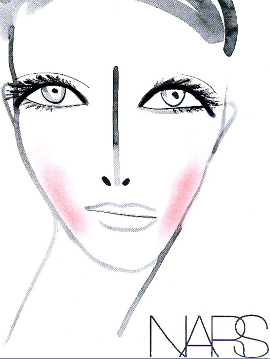
INSPIRATION & LOOK: “The look started with a picture that Marc had of Christy Turlington with really fresh skin and rosy cheeks,” said François Nars, Founder & Creative Director of NARS Cosmetics. “Marc wanted ‘icy cold cheeks’ and so the blush is drawn down in such a way that’s unusual…unusual, but decadent. Like a Renaissance painting.”

Look at those proper Autumnal colours!  Warm reds and ambers… God, it makes me grateful it’s still only April and we have the whole Summer stretching ahead of us!

The key products used in the looks featured here are:

FACE

  • Concealer (NEW for Fall 2011; for now, try the existing Concealer £17.50)

EYES

LIPS

Interrrrestingggg…. so, it looks like we’re getting (at least) a newly formulated concealer range, duo eyeshadow (orange-based?), a new long-wear eyeliner range?  I’m speculating a little bit….

Not too sure on that blush placement… but that’s fashion for you (darling) and I love the heavy liner… oooooh, I’ll be a happy Lipglossiping if we’re all about the heavy liner this Autumn!

But in the meantime, let’s have some bloody sunshine first eh?!

Butter London Spring/Summer 2011 – Blagger NOTD

Posted by Lipglossiping On April - 1 - 2011

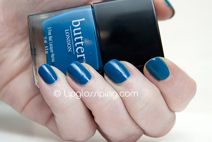
A bright, strong… vivid blue creme.  Perfect for tips or toes this Summer!

A solid two-coater, a great all rounder with average wear of 2/3 days before the tips start looking a bit ragged.  No chips but as I’ve said many times… I don’t generally suffer from poor nail wear.

It feels like a very clean colour that is somehow almost sensible enough to wear in the office.  Of course, being BLUE it isn’t.  But it just gives an impression of formality.  That makes more sense in my head than it does on this page.

But the thing is… surely it’s incredibly dupable?  And at £11.95, you’d hope it might be…

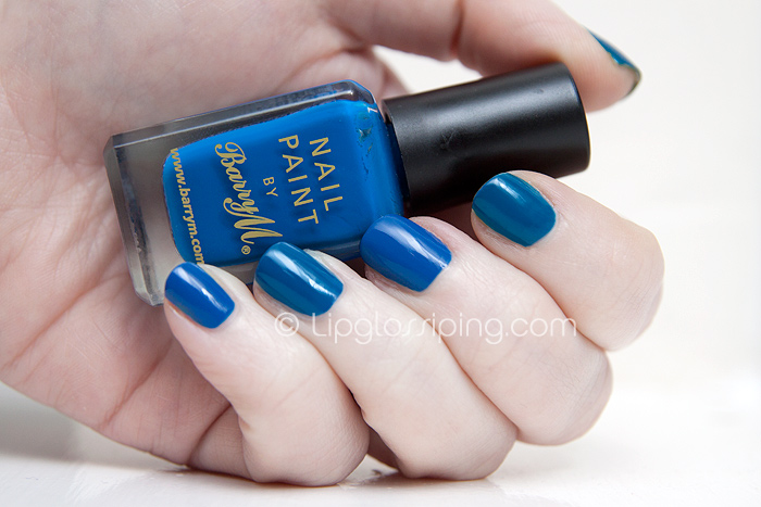
I went and bought BarryM‘s Cobalt Blue to compare because I figured it would probably be the nearest match (off the top of my head):

In the above photo, I’m wearing Cobalt Blue on the little and middle fingers whilst I’m sporting Blagger on my index and ring fingers.  They’re similar but Blagger has a teal edge to it and isn’t quite so “primary” blue after all.

What do you think?  Is the difference worth £8.96?

You can purchase Butter London Blagger online from PowderRooms priced at £11.95

Celebs pucker up for The Prince’s Trust!

Posted by Lipglossiping On March - 31 - 2011

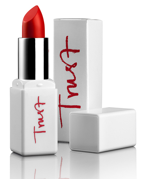
You may have already heard about Karen Alder’s new lipstick creation – TRUST which has been developed to raise funds for the youth charity, The Prince’s Trust.

100% of the proceeds from the sales of TRUST (exc. VAT) will go directly to the charity!

I thought I’d share some images of the celebrity supporters sporting the lipstick (in various guises!) and I particularly adore Kara’s playful pose! (bottom right)

Karen Alder, Celebrity Makeup Artist and creator of the TRUST lipstick said…

I love the power of the colour red – no other shade has such an impact.

I call it a not-so-secret weapon.  My new creation – TRUST – is a foolproof easy to wear bright red, packed with Vitamin E. To me, this is the perfect red, striking the balance between the orange tones and blue. Its satin finish really makes it easy to apply without bleeding, yet keeps the look contemporary.

What with being ALL about the red lipstick, I’ll be logging on to snap one of these babies up quicker than you can say ‘big ears’.  Wait… can I get put in the tower for that?

The limited edition lipstick will go on sale on the 2nd of April exclusively at QVC UK.

You will be able to log on to the QVC website or call 0800 50 40 30 to buy one and it’s priced at a bargainous £8.00

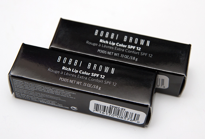
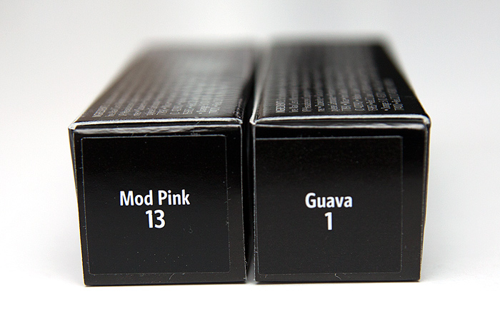
Bobbi Brown Rich Lip Color Lipsticks in Mod Pink & Guava

Posted by Lipglossiping On March - 31 - 2011

When I was in London last week, I was on a lipstick mission… overtaken by the urge to find something to tempt me, I came home with more than I bargained for – a new lipstick obsession!

The new Bobbi Brown Rich Lip Color’s had been piqueing my interest for a few weeks now and I headed to the counter in HoF Westfield to take a closer look.

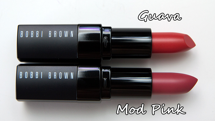
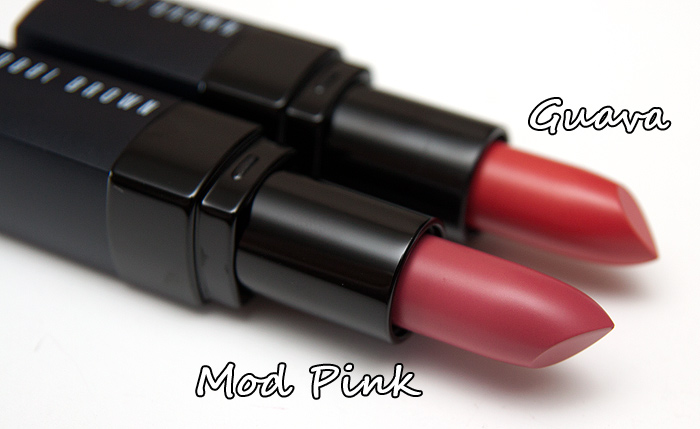
The new Rich Lip Color range comprises of 12 relatively bright shades which definitely lean more Summery than Autumn/Winter in my opinion.  I chose two from the 12: Mod Pink and Guava.

Mod Pink was a shoo-in from the moment I spied the bullet.  It’s a lovely pink for Spring/Summer.  I took a bit more convincing with the other despite previously professing my love for all things Guava!  I was just a little unsure if it would be too warm and be a bit too “Oh HAI lips!”

I am pleased with myself that I pushed out of my comfort zone… not only that but I completely avoided Old Hollywood, a particularly lovely-looking red!

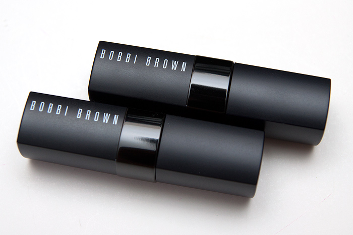
The packaging is the typical, sleek Bobbi Brown affair… nothing particularly exciting, just understated and elegant enough to pull out in public should you do that sort of thing!

God I love new lipsticks! *drool*

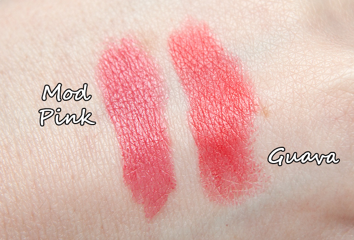
The texture of these is good!  Firm but smooth to apply with barely any drag on the lips.  Pigmentation is high (as you would expect from a range called “Rich Lip Color”.

Finish-wise, the two that I own are both semi-matte and despite this, they feel extremely comfortable on the lips and not particularly drying considering the very good wear I achieve from them.  I would estimate at around 4/5 hours without eating or drinking.

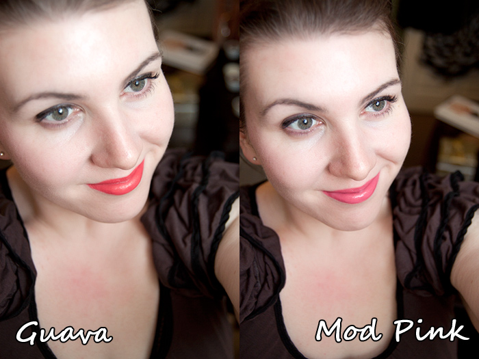
And here’s how they look in context with my face…

Bobbi Brown Rich Lip Color Lipsticks are priced at £16.00 each on counter but are currently available on the House of Fraser website with 10% off.

Next on my list is Bikini Pink!

Are you planning on checking these out? Have you bought any already?!

Site Feedback…

Posted by Lipglossiping On March - 30 - 2011

Hello ladies,

I really appreciate ALL feedback on the new site, both good and bad because I recognise that a). you’ve taken the time to leave it and b). you’ve (mostly) broken the bad bits to me gently!  Thank you x

I want to address a couple of things and I’ll try not to ramble too much…

Ads

There are actually LESS ads on the site now than before the redesign.  Previously, the homepage contained an ad below each post, 1 in the sidebar and the leaderboard ad under the header.  Now the homepage contains the leaderboard ABOVE the header (I wanted to separate it further from the content) and 1 in the sidebar.  The in-post ones now only display inside the ‘actual’ posts.

I wanted to clarify that one so you don’t think the redesign was some cynical money-making opportunity!

Personalisation

I like to think that the site personality comes more from the content than the boxes that surround it but all I can really tell you is that I’ve injected SO much thought into choosing clear fonts, contrasting labels, a ‘snazzy’ header that actually represents my obsession and trying to increase interactivity with you guys in the form of linkbacks to you (if relevant) through comment listings etc.

What I’m getting at is that I didn’t just pick a generic corporate style template and click ‘activate’.  I picked a basic layout design, then ripped it to shreds and started again.  It’s got personality by the bucketload, I can’t help it if I’m a bit boring! 😉

I wanted you to have access to as many posts at a single glance as possible.  This was the trade off between the original scrolling design and how it looks now.  To be completely honest, I struggled like hell with this one.  Do I give you all an extra click or more content at a glance?  The thing that swung it for me was being told that doing it this way *should* reduce site load time.  With my previous design, it was having to load anything up to 20 fullsize images with every load, this way… it caches the thumbnails after the first load and that’s it.  Having said that, I’m aware that my site load time has been shit for about three days now and I’m just about ready to move hosts again.

Professionalism

I’m not sure if it’s considered a bad thing to have a professional looking blog.  I can’t quite tell from your comments.  But my personal feeling on this is that when I dedicate a minimum of 3/4 hours on this labour of love each day… hell yeah I want it to look as “professional” as possible!

Busyness and Background

Yes, there’s more content in a smaller area (on the homepage)… hopefully, there is enough spacing, labelling and separation for things to be quite straightforward once the dust settles and you get used to looking to different parts of the page to achieve/view different things.  I’m going to give that some time to “settle in” before considering any changes incase the busyness view is influenced by the fact that it’s all very new and unfamiliar.

The background… I know that my site is associated with a white background.  2 years ago, the site really stood out by being so minimalist in the beauty-blogging community but now, I feel that the overall look has become quite generic.  I’ll never be one for teacups, garlands and textured backgrounds and want something different again.  If I’ve achieved that (even if you’re not sure about it!) then hand on heart, on a personal level – that makes me happy.

However, I’ve always been the one to point out that black backgrounds are less user-friendly for reading text (which is why I’ve retained a white background for the content!)  I think this is another aspect of the redesign that I’ll look at again in a few weeks.

Overall

Ok, I can tell I’m starting to ramble so will leave it there.  The new site is my baby and like every proud Mum I want to show it off and I want you all to think it’s not a cabbage patch doll.  BUT sometimes, babies take a while to grow into their features.  I hope you give mine a little bit of time to develop, it’s your views I care about most of all and I am listening.

Deal Alert: 25% off at Illamasqua in conjunction with Stylist.co.uk

Posted by Lipglossiping On March - 30 - 2011

Some savings are worth taking a closer look at and this one from Stylist.co.uk definitely had me going in for a more detailed inspection!

Stylist have teamed up with cult British brand Illamasqua to offer a 25% discount online at Illamasqua.com – the discount code remains valid for use until 5pm on the 6th April, so you still have some time to get your shopping lists in order!

To get your hands on the code and to read the terms and conditions, click through to Stylist.co.uk and take a look.

Happy bargain hunting!

Butter London Spring/Summer 2011 – Teddy Girl NOTD

Posted by Lipglossiping On March - 30 - 2011

If pastel pinks are your thing, you’re in for a treat!

Now… I don’t wanna get too cultural about things (says the lady with the degree in Cultural Studies) but DUDE! What’s with calling a Mod Pink “Teddy Girl”… tsk.

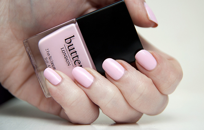
Names aside, Teddy Girl is a very striking pepto-bismol pink creme that needs a few coats to rescue it from streaksville.  This isn’t uncommon with these ‘white-out’ shades but it is irritating nonetheless when you get pretty good cover from the first coat.

Once any patches have been evened out, wear is perfectly adequate and the shade is super-striking.  I love combining it with a black outfit to really make my nails POP!

Butter London – Teddy Girl is is available to buy online now from PowderRooms priced at £11.95

Join Acqua for Life on Facebook and raise a bucketload (literally)

Posted by Lipglossiping On March - 30 - 2011

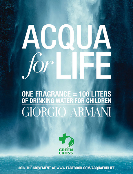
Let me introduce you to the “Acqua for Life Challenge”.  A facebook campaign set up by Giorgio Armani Beauty (in conjunction with their popular fragrances Acqua di Giò and Acqua di Gioia).

The campaign aims to provide a minimum of 40 million litres of drinking water to populations without any access to it, working in partnership with Green Cross International to raise everyone’s awareness of this issue.

900 million individuals are still deprived of safe, clean and healthy water for their daily essential needs. Water that is essential for drinking, eating, guaranteeing a minimum of hygiene and maintaining one’s health.  The goal of this challenge: To offer this year a minimum of 40 million litres of drinking water to populations in need.

Because they are the most vulnerable to water-borne diseases and it is their future that is taken hostage by this uncertain water supply, children will be the primary beneficiaries of the donations collected by the “Acqua For Life” campaign.

The operation will initially begin in Ghana, supporting the Smart Water for Green Schools project: In this west African country some 40% of the rural population does not have access to drinking water.

The money raised will then be used, over time, to finance similar operations in other countries.

So, how can you contribute?

Easily and quickly.

I’ve set up a Lipglossiping Acqua For Life Facebook group and all YOU need to do to contribute 10 litres of water to the cause is join up.  It will literally take you 15 seconds.

Click the link above and grant the app access (it won’t do any funny business with your account!)

SEARCH for the term Lipglossiping in the left hand side community search bar and hit on JOIN.  Thassit!  All signed up, 10L of fresh, safe drinking water with your name on it!

If you join up, consider your good deed for the day done and dusted and have a BIG thank you from me. x

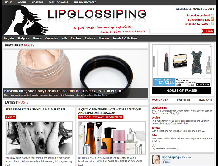
Shiny new site design!

Posted by Lipglossiping On March - 30 - 2011

Welcome to the new look Lipglossiping.com – I had a mini heart attack when I flicked over to the new design.  Properly too, my fingers tingled as I got flashbacks from Christmas!

Thankfully, everything still seems to be in place with no major casualties (apart from my blogroll which I’ll update next week).

I do hope you like it and I’m sure it will take a bit of getting used to… it’s a completely new navigation system but you should get enough of an idea from the front page as to whether or not the featured posts hold any interest for you before clicking through to read them in full.

Plus, you get the tabs over on the right to browse through some of my most popular posts, play russian roulette with a random pick and see who’s commenting on what!

Other features include tags and categories that are much clearer to read and easier to access whatever it might be that you’re looking for!

And let’s not forget the most important feature of all.  The chick up there… there, in the header!  She applies her lipstick when you hover over her! *dies*

*deep breath* go on, let me have it… do you hate it?

RANDOM

Beauty Blog Link Love: 08/10/2011

Welcome to the new look Lipglossiping.com – I had a mini heart attack when I flicked over to the new design.  Properly too, my fingers …

The Lipstick League – week of 3.12.12

Welcome to the new look Lipglossiping.com – I had a mini heart attack when I flicked over to the new design.  Properly too, my fingers …

What's Up Doc? Competition Time: WIN a super LUSH treat this Easter!

Welcome to the new look Lipglossiping.com – I had a mini heart attack when I flicked over to the new design.  Properly too, my fingers …

Something a little bit different...

Welcome to the new look Lipglossiping.com – I had a mini heart attack when I flicked over to the new design.  Properly too, my fingers …

If there's one thing getting me all hot under the collar...

Welcome to the new look Lipglossiping.com – I had a mini heart attack when I flicked over to the new design.  Properly too, my fingers …

"Have a go hero" or leave it to the professionals?

Welcome to the new look Lipglossiping.com – I had a mini heart attack when I flicked over to the new design.  Properly too, my fingers …

Dr. Hauschka shows us that Natural Makeup doesn't = boring makeup

Welcome to the new look Lipglossiping.com – I had a mini heart attack when I flicked over to the new design.  Properly too, my fingers …

Beauty Blog Link Love - 03/07/2011

Welcome to the new look Lipglossiping.com – I had a mini heart attack when I flicked over to the new design.  Properly too, my fingers …

Oskia Signature Glow Facials: 12th-15th June at Liberty!

Welcome to the new look Lipglossiping.com – I had a mini heart attack when I flicked over to the new design.  Properly too, my fingers …

Foaming an opinion on hair dye... *groan*

Welcome to the new look Lipglossiping.com – I had a mini heart attack when I flicked over to the new design.  Properly too, my fingers …

POPULAR

CLOSED: Competition Time: Givenchy Very Irresistible L'eau en Rose Perfume!

Welcome to the new look Lipglossiping.com – I had a mini heart attack when I flicked over to the new design.  Properly too, my fingers …

CLOSED - Win it! The Body Shop Expert Brush Collection

Welcome to the new look Lipglossiping.com – I had a mini heart attack when I flicked over to the new design.  Properly too, my fingers …

Win a gorgeous "glow" trio with prizes from Urban Decay, New CID, & Arbonne!

Welcome to the new look Lipglossiping.com – I had a mini heart attack when I flicked over to the new design.  Properly too, my fingers …

Hello? Is this thing on?

Welcome to the new look Lipglossiping.com – I had a mini heart attack when I flicked over to the new design.  Properly too, my fingers …

Avoid the brush off with Oral-B Pro-Expert

Welcome to the new look Lipglossiping.com – I had a mini heart attack when I flicked over to the new design.  Properly too, my fingers …

Big savings on French Pharmacy brands, win my Escentual.com top picks!

Welcome to the new look Lipglossiping.com – I had a mini heart attack when I flicked over to the new design.  Properly too, my fingers …

Win it! 3 EcoTools Bamboo Bronzer Brushes to win!

Welcome to the new look Lipglossiping.com – I had a mini heart attack when I flicked over to the new design.  Properly too, my fingers …

FOTD Busting out of the comfort zone!

Welcome to the new look Lipglossiping.com – I had a mini heart attack when I flicked over to the new design.  Properly too, my fingers …

Dear Obesity...

Welcome to the new look Lipglossiping.com – I had a mini heart attack when I flicked over to the new design.  Properly too, my fingers …

Urban Decay The Black Palette - Photos & Swatches

Welcome to the new look Lipglossiping.com – I had a mini heart attack when I flicked over to the new design.  Properly too, my fingers …

COMMENTS

  • Categories

  • Archives

  • Admin

  • Ads