Hello ladies,
I really appreciate ALL feedback on the new site, both good and bad because I recognise that a). you’ve taken the time to leave it and b). you’ve (mostly) broken the bad bits to me gently! Thank you x
I want to address a couple of things and I’ll try not to ramble too much…
Ads
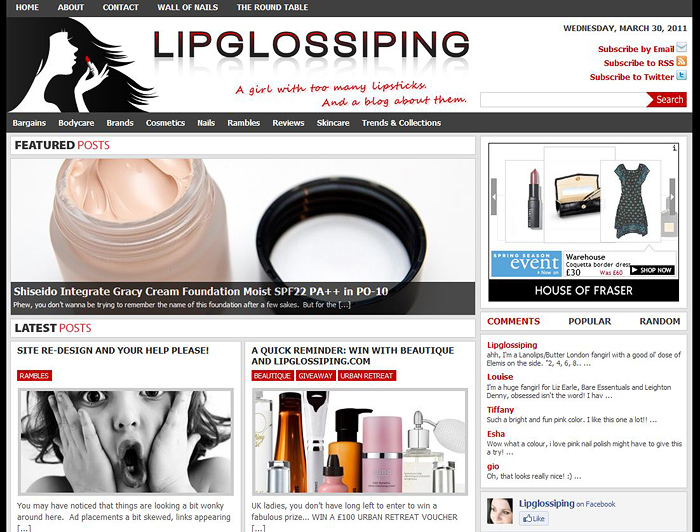
There are actually LESS ads on the site now than before the redesign. Previously, the homepage contained an ad below each post, 1 in the sidebar and the leaderboard ad under the header. Now the homepage contains the leaderboard ABOVE the header (I wanted to separate it further from the content) and 1 in the sidebar. The in-post ones now only display inside the ‘actual’ posts.
I wanted to clarify that one so you don’t think the redesign was some cynical money-making opportunity!
Personalisation
I like to think that the site personality comes more from the content than the boxes that surround it but all I can really tell you is that I’ve injected SO much thought into choosing clear fonts, contrasting labels, a ‘snazzy’ header that actually represents my obsession and trying to increase interactivity with you guys in the form of linkbacks to you (if relevant) through comment listings etc.
What I’m getting at is that I didn’t just pick a generic corporate style template and click ‘activate’. I picked a basic layout design, then ripped it to shreds and started again. It’s got personality by the bucketload, I can’t help it if I’m a bit boring! 😉
I wanted you to have access to as many posts at a single glance as possible. This was the trade off between the original scrolling design and how it looks now. To be completely honest, I struggled like hell with this one. Do I give you all an extra click or more content at a glance? The thing that swung it for me was being told that doing it this way *should* reduce site load time. With my previous design, it was having to load anything up to 20 fullsize images with every load, this way… it caches the thumbnails after the first load and that’s it. Having said that, I’m aware that my site load time has been shit for about three days now and I’m just about ready to move hosts again.
Professionalism
I’m not sure if it’s considered a bad thing to have a professional looking blog. I can’t quite tell from your comments. But my personal feeling on this is that when I dedicate a minimum of 3/4 hours on this labour of love each day… hell yeah I want it to look as “professional” as possible!
Busyness and Background
Yes, there’s more content in a smaller area (on the homepage)… hopefully, there is enough spacing, labelling and separation for things to be quite straightforward once the dust settles and you get used to looking to different parts of the page to achieve/view different things. I’m going to give that some time to “settle in” before considering any changes incase the busyness view is influenced by the fact that it’s all very new and unfamiliar.
The background… I know that my site is associated with a white background. 2 years ago, the site really stood out by being so minimalist in the beauty-blogging community but now, I feel that the overall look has become quite generic. I’ll never be one for teacups, garlands and textured backgrounds and want something different again. If I’ve achieved that (even if you’re not sure about it!) then hand on heart, on a personal level – that makes me happy.
However, I’ve always been the one to point out that black backgrounds are less user-friendly for reading text (which is why I’ve retained a white background for the content!) I think this is another aspect of the redesign that I’ll look at again in a few weeks.
Overall
Ok, I can tell I’m starting to ramble so will leave it there. The new site is my baby and like every proud Mum I want to show it off and I want you all to think it’s not a cabbage patch doll. BUT sometimes, babies take a while to grow into their features. I hope you give mine a little bit of time to develop, it’s your views I care about most of all and I am listening.
