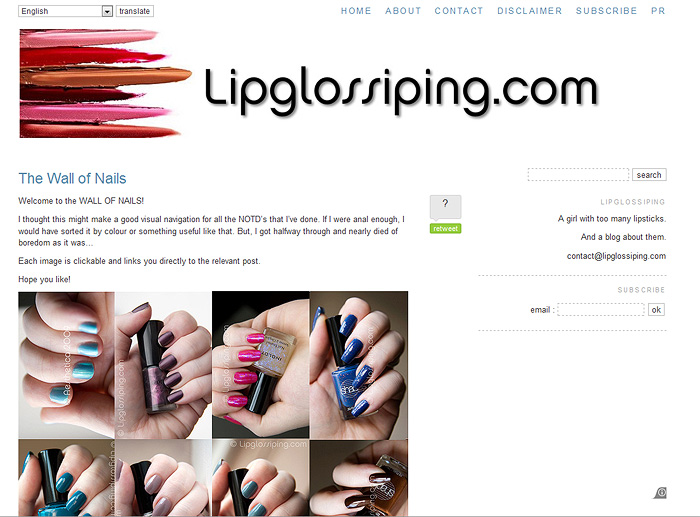
Just a little something I slaved over last night…
Something I would dearly love to improve is the navigation of this site. I’ve always been a good girl and ‘tagged’ my posts with relevant info and made sure to pop it in it’s correct category… but I just think it could be better.
And this is my first step…
Apart from making me realise how many bottles of nail polish I must own (eek), it’s made me realise that I hate any and all kinds of organisation. I was gonna turn all the photos the right way up… but I got bored. I was gonna categorise the polishes by colour… but I got bored. I was gonna… well, you get the idea.
You can hover your mouse over one of the small photos and it will display the shade name. You can click one of the images and it will take you to the relevant post. Nifty eh?
Now, I just gotta keep it updated! *ahem*
.
I’d REALLY love to hear what you guys think about the site navigation and if you have any bright ideas of how to make it more accessible, I’m all ears!


wow that must’ve taken ages to do!! thanks for sharing, the colours are so pretty!!
What a great idea! I love how it showcases your photography. Maybe you could add text of its name there — will help Google direct new readers there from searches too.
This really looks good and it’s so informative, you can look out for a colour you like and you are all sorted. But it really must have taken you ages!
To be honest I love your navigation, but would love to know if others have any ideas. Think I need a few helpful hints for my blog.
Wow lady you have a lot of nail polish!! Loving the idea though 🙂 Xxx
This wall is a great idea, thanks! 🙂
I love the nail wall! But i love your current site navigation. I hate when you go on a blog and everythings categorized according to subject, not date. It’s less blog-y and more frusturating for when i just wanna type in a url and read.
I’m sure you’ve got more ideas like the nail wall though, keep up the good work 🙂
Love this post. It looks like you put so much work into this. It looks great by the way 🙂
That is super cool!
Love this idea, especially as you NOTD’s are always really nice, good work x
Crikes – what an effort Props to you though… obviously got a milder case of ADHD then me.
This is amazing Charlotte – It is so visually appealling, pure art,
well done.
Love the idea, it’s looks great and so informative. It must have taken ages to do, thanks.
Love this, I have amazing amounts of nail jealousy now as your nails always look fantastic – I thought I had a lot of nail varnish and I have 75 bottles! Better keep going to catch up with you :0)
Your nail posts.. are one of my faves!
I’m always waiting to see what colour you will pop up next.
LOVE LOVE LOVE the wall of nails..
Soo much easier to navugate and ogle at all these gorgeous colours
fascinated by the technicality of this.
imagemapping, right? such a good idea
could have seen myself trying to build a table and inserting mini pictures and taking it forever. we need a link to the wall of nails on the homepage, like a fancy badge or something linking straight to the wall, maybe with a pic of a nail lol xx
Fabulous idea! I love it! =)
The thing that I love about the photographs you take is the lighting because it allows us to see the how the polish would look in real light.
I actually love the navigation because it seems no fuss and I find things way sooner that in other sites besides it loads super fast.